|
Hello, everyone! It's been quite a while since I've been tasked with reflecting upon some readings, but today I'll be reverting to that exact duty! Because of the great number of readings I have to cover - alongside their extensive lengths - prepare yourselves for some rapid-fire analysis!  Hopefully you won't feel like this upon reading my blog post... So up first is Erica Robles-Anderson and Patrik Svensson's "'One Damn Slide After Another': PowerPoint at Every Occasion for Speech." Now, here's an article that epitomizes the necessity of the common web acronym "TLDR"! It extensively outlines the history of Microsoft Powerpoint (logo pictured below) and its predecessors, alongside their pros and cons. Robles-Anderson and Svensson argue that Powerpoint doesn't garner enough public recognition despite its dominance over the communicative landscape since the dawn of personal computers. Furthermore, they stress the importance of acknowledging slideware's ability to not only distill info, but also present it in a unique manner. Lastly, the authors encourage us to devise alternative presentation mechanisms that allow for critical thought. Admittedly this is a fascinating case study, but if you don't have much time on your hands and/or aren't a hyperenthusiastic tech junkie, then the introduction and/or conclusion should suffice for your comprehension.  One of many accessible platforms that ironically inspire long-winded analysis Next we have Jenny L. Davis and James B. Chouinard's scholarly article, "Theorizing Affordances: From Request to Refuse." Because I couldn't possibly summarize said article more adequately, allow me to quote its abstract: As a concept, affordance is integral to scholarly analysis across multiple fields—including media studies, science and technology studies, communication studies, ecological psychology, and design studies among others. Critics, however, rightly point to the following shortcomings: definitional confusion, a false binary in which artifacts either afford or do not, and failure to account for diverse subject-artifact relations. Addressing these critiques, this article demarcates the mechanisms of affordance-- as artifacts request, demand, allow, encourage, discourage, and refuse—which take shape through interrelated conditions: perception, dexterity, and cultural and institutional legitimacy. Together, the mechanisms and conditions constitute a dynamic and structurally situated model that addresses how artifacts afford, for whom and under what circumstances. But unlike with the previous article, I'd highly recommend that you give this one the light of day in its entirety, for it's considerably more reader-friendly in terms of its wording, conciseness, and relatable examples. In fact, I've inserted Davis and Chouinard's article in PDF form below for any interested parties:
Throughout his brief article, "Datacloud: Expanding the Roles and Locations of Information," Johndan Johnson-Eilola provides a general timeline of various computer-based interfaces and contextualizes their implementation within different forms of work and learning. I appreciate the copious graphics that complement his points, particularly as someone who isn't the most computer-savvy person in the world. Check out Johnson-Eilola's article in PDF form below:
Next in line (I'm almost done, I promise!) are a couple chapters from Amy J. Ko's "User Interface Software and Technology" online textbook. Chapter two outlines a theory of user interfaces, while chapter three describes what interfaces mediate. Although these readings largely lack the multimodal stimulation that some of the others offer, they're still basic and insightful enough to merit your attention. Lastly, check out this neat video about graphical user interfaces! All of you audiovisual learners and historical buffs should get a true kick out of it: That's about all I have for you today, and until next time, I'll leave you with a Melodramatic Mike Drop™! 
20 Comments
Hello, everyone! After sketching out my capstone project concept earlier this week, it's time for me to spruce things up a bit with my project pitch! Here goes nothing:  Random example of a dude who serves up terrific pitches on a regular basis So national voter turnout rates are criminally low given the importance of exercising our voting right and myriad of opportunities for us to do so. College students (e.g. I and several of you reading this) constitute the largest voting demographic, yet turn out at the lowest rates come Election Day! Contrary to popular belief, this doesn't indicate apathy on our part - in fact, we're some of the most passionate advocates of civic engagement - but rather exhaustion surrounding the involvement process, in which I believe the faulty structure of our current voter registration forms plays a key role. Therefore, I've decided that I want to create the optimal voter registration form for all U.S. citizens of legal age (18 or older), correcting some major flaws I found upon analyzing a small sample of state forms and thus making the forms more accessible to interested parties. For instance:
But wait, how'll I execute all this? Well...
Now, you're probably thinking, Mike, this sounds like so much work! How'll you pace yourself through all this? Fair question, which I'll answer to the best of my ability. Given the extent of my schedule - which is incredibly packed and has a considerable number of moving parts - I don't feel so comfortable committing to particular dates at the moment, but I can try to estimate the weeks during which I'd like to accomplish certain tasks. Here's a tentative timeline for the completion of my capstone project: Week ending on October 5: Complete Step 1 Week ending on October 12: Complete Step 2 Week ending on October 26: Complete Step 3 (just in time for my "Project prototype" deadline on October 25) Week ending on November 2: Complete Step 4 Week ending on November 9: Complete Step 5 (and create a promotional social media post on Facebook and Twitter for my "Project trailer," which is due on November 8) November 22: Complete Steps 6 and 7 In conclusion, I'd like to address my project's potential impact. As one of my peers and even my professor suggested, I could certainly present this to state government officials with a letter outlining my intentions. I'm incredibly fortunate to have extensive writing experience across a wide array of genres - including that of the formal letter - and my affiliation with UConnPIRG should facilitate my connections to local legislators. Even if my project proves more inconsequential than I'd like, I'm still excited to undertake this initiative for an issue that's been one of my greatest passions for about half of my existence thus far! That's about all I have for you today, and until next time, I'll leave you with a Melodramatic Mike Drop™!  Hello, everyone! My recent tool review really got me brainstorming about the possible forms that my capstone project could take, and now I'm ready to expand upon these a bit further!  No, not quite the kind of expansion I had in mind... As I've mentioned a few times already, my ultimate goal is to create the optimal voter registration form for use by any American of legal age (i.e. 18 or older). National voter turnout rates are criminally low - particularly from the youngest demographic, which has the most potential to advance society - and I believe that the faulty structure of our voter registration forms plays a critical role in this disturbing trend. Allow me to restate the major qualms I had upon analyzing a small sample of said forms a couple weeks ago: I know that these are formal government documents, but they still look so dry and boring! We need much more than the occasional hint of multichromatic and multimodal stimulation in order to entice people to complete these forms. So then how'll I address these issues, exactly? Well...
 Now, what form (no pun intended) might my capstone project ultimately take? Let's propose some ideas:
I'll conclude by saying that y'all should celebrate National Voter Registration Day on September 24 by spreading awareness about civic engagement and registering yourselves to vote if you haven't already (seriously, it's so important!)! If you're a UConn student like yours truly, you can visit UConnPIRG's voter registration tables on Fairfield Way from 11 am-5 pm on September 24 and 25, as well as attend UConnPIRG and USG's HuskyEngage Summit on September 28 (more info here). That's about all I have for you today, and until next time, I'll leave you with a Melodramatic Mike Drop™!  Hello, everyone! I'll keep this post on the shorter end, especially following the extensive genre analysis I just finalized at the beginning of the week. Today I'll closely examine a "tool" (i.e. a platform) that I'm strongly considering for the creation of my capstone project, followed by some quick breakdowns of my alternatives. So as y'all hopefully remember, my goal is to create an optimized voter registration form for use by any American. This would mainly involve me creating a doc on my computer, so I don't feel much of a need to use anything sophisticated like Photoshop or any video-editing programs. Rather, I'll stick with what I know best and elevate my usage of a more accessible platform. My primary choice of platform for the creation of my capstone project is Google Docs (pictured below): 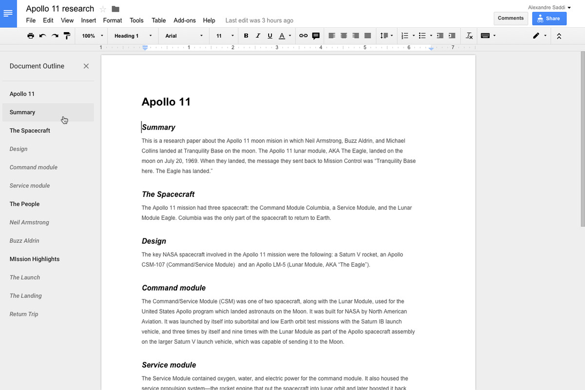 Me finding a random pic online after my attempts to take a print screen go awry So as you can see, the interface provides several different formatting options, yet remains quite simple and straightforward. As someone who lacks great experience in the design aspects of media creation - despite my best efforts to mix things up for the sake of this blog - this is a major positive. I also like that it's online; thus as opposed to me having to switch between windows constantly, I can just create new tabs and copy whatever images and other elements I desire straight into my doc. But perhaps the most appealing feature: autosaving. Boy, will it be nice to not have to waste time saving my work every few minutes in fear that my computer will suddenly shut down and rob me of my progress! I can also jump into my analysis of the form's different components - or even start brainstorming - without skipping a beat! My only significant concern is that the platform is so dependent upon me maintaining a steady Wi-Fi connection, and UConn's Wi-Fi isn't the greatest, to put it kindly. And for the sake of embedding my project within a blog post, it might be easier for me to just work within, say, Microsoft Word from the beginning and not have to worry about any drastic formatting changes when I download my Google Doc as a Word Doc. Speaking of which, allow me to briefly ponder some other options at my disposal: Microsoft Word: As I implied above, Word would be my main alternative. Although I have my minor quibbles with it, it's still a reputable platform that offers up some unique advantages over Google Docs. Google Slides (pictured below): Another avenue I've been considering is creating the voter registration form within a Doc processor as outlined, but then using a slide presentation program to exhibit said form and describe each of its elements more in-depth (i.e. devoting a slide to each one). This is quite appealing from an organizational perspective, and I can also create a more dynamic project by incorporating slide animations/transitions and several more visual (and perhaps even audio) elements! Instead of merely offering some drab, long-winded analysis of my project, I can simply provide bullet points and then write up slightly more-detailed descriptions within each slide's "speaker notes" section! My major qualm here is that I wouldn't be able to create my form within Google Slides, which would force me to take low-quality screenshots from my phone (unless, of course, I'm able to capture a print screen somehow). 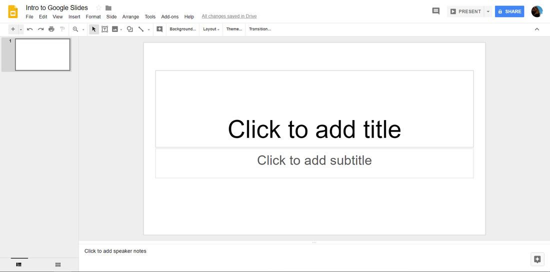 Microsoft Powerpoint: Like Google Slides, but without the burden of needing a Wi-Fi connection or the convenience of autosaving. That's about all I have for you today, and until next time, I'll leave you with a Melodramatic Mike Drop™!  Hello again! Well, I've been teasing y'all for about a week now, so I'd say it's about time that I finally deliver upon my promises! Today I'll be providing an in-depth analysis of U.S. voter registration forms, taking examples from different states and compiling my observations. But before I get into the fun part, I should probably provide you with some basic, yet obligatory explanations...  Hey, don't look at me like that! I'll make it quick, I promise! So, the name of my genre pretty much tells you everything you need to know. "U.S. voter registration forms" - they're forms that you use to register to vote, meant for any U.S. citizen who'll be of legal age (18) by the next electoral cycle. But I'm not just talking about presidential elections, or even congressional races for that matter! Technically speaking, every year is an election year, whether you consider the federal, statewide, or municipal level. Yet despite the importance of obligating our civic duty and the wealth of opportunities for us to do so, we're seeing criminally low voter turnout rates - particularly among young people, i.e. the people who're best equipped to effect positive change! Of course, voter registration forms are produced by each state's government. You can typically find them at a DMV facility, your local town registrar, or even some schools. And in the digital age, there are plenty of online and mobile avenues for voter registration, too (I may speak more to these not today, but sometime soon). For the purposes of this analysis, I'm sticking with the tried and true document, of which I've found several variations. Speaking of which...  Alright, alright! Take it easy now, guys and gals! My first example for this analysis actually comes from my genre announcement last week. Given that it's my home state, I figured that Connecticut would be a logical starting point. For those of you who didn't catch my original post upon its publication, allow me to reinsert the official form and my thoughts on it:
So, this document's pretty straightforward, right? In a concise, yet explicit manner, it gives you all the info you need to fill out the form properly. Each section is signified in ALL CAPS for easy access, with its main points arranged in bulleted or numbered lists and any especially pertinent details either underlined or emboldened. And the best part is that these instructions only take up about half the page, while the other half is devoted to individual documentation of each prospective voter. If I had to critique anything about the form, I'd say that it's quite achromatic, feels a bit cramped (particularly in the documentation section), and lacks variation in communication medium (i.e. the document's contents are predominantly text-based). Surely this is a solid stepping stone, but I need a bit more in order for my analysis to feel substantial. As important as it is for every state to have its voting registration practices inspected and improved upon, such a feat simply isn't tenable for an individual undertaking. So then where do I go from here? Well, I'll consider arguably the most urgent cases - populous swing states! Think about it - given the magnitude of their influence in our elections, it's imperative that as many of their citizens as possible can and want to make their voices heard! Let's begin with the most populous of these states: good ol' Florida sunshine!
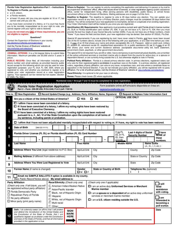 In this one, you see much of the info in paragraph form. I mean, yuck! However, at least each section has a bolded title, and the notes for discouraged actions have titles that are written in ALL RED CAPS (now, that's a safety warning if I've ever seen one!). Scrolling down to the documentation section, I'd say this one is much-improved from that of my home state. A gray box to signify the beginning of a new section, a link to complete the form online (way to get with the times!), and much more space to write within each box, oo la la! And even a new feature: a separate page full of destinations to which state residents can mail their forms! All in all, this one ain't too shabby. But let's see if the Penn is mightier than the shore:
Now, this one's definitely unique. Right off the bat, I see that it's four pages long, and I think, this is way too much, nobody would want to fill this out. But upon further inspection, perhaps that's a harsh way to look at it. First off, the Pennsylvania form lists its voting info in columns, with bolded titles and a mix of short paragraphs and bullet points. I won't lie, it looks pretty slick! Also, this is the first form I've perused that explicitly addresses non-English speakers, providing an avenue for obtaining a form written in Spanish! As does Florida, Pennsylvania provides a separate page listing addresses to which state residents can send their forms. And then its documentation section is so spaced out, it takes up over a page! In contrast to the other forms I've examined, Pennsylvania's devotes an entire row to each category before moving on to the next. It's nice that this one doesn't feel too cramped, and I'm sure it makes citizens feel that the voter registration process isn't too overwhelming. Other unconventional, yet much-appreciated elements include a mapping tool for the rural residents and homeless and a detachable envelope for sending the completed form to the appropriate County Voter Registration Office! I'll shut up about this one now, but man, am I intrigued by it! Ohio, you're up next:
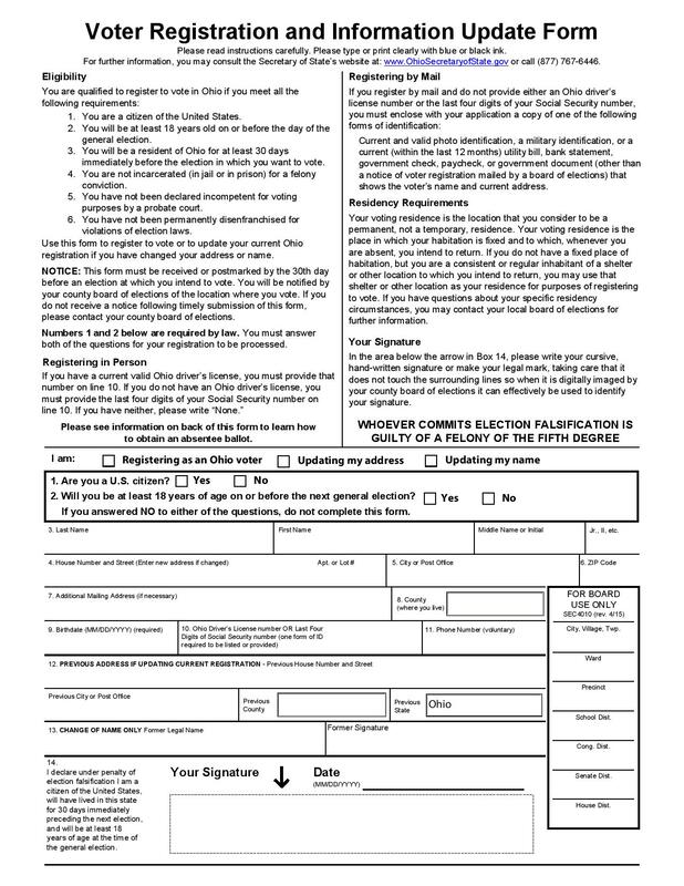 I find this one a bit underwhelming, especially after all the gushing I just did over Pennsylvania's form. For starters, much of the info in the first page's bolded sections is written in long-standing paragraphs, which I'm sure will immediately turn off a ton of people. Then, the documentation section harkens back to that of Connecticut's form; it gets the job done, but it just feels a bit cramped on half a page. But the thing that baffles me most is that there's even more pertinent info on a separate page after the documentation section, with section titles in BOLD AND ALL CAPS! I mean, why not just place it with the other info and keep the layout consistent? After all, both sections end with the same warning that "WHOEVER COMMITS ELECTION FALSIFICATION IS GUILTY OF A FELONY OF THE FIFTH DEGREE," so clearly they relate to each other anyway. Then you could devote an entire page to documentation. Overall, Ohio's form is serviceable, but many of its design choices just confound me! On to North Carolina:
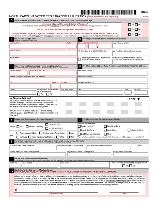 On the top right you can see a barcode, which definitely makes this form feel more official (or reminds me of grabbing my receipt as I depart from Price Chopper carrying bagfuls of groceries, but I guess either sentiment is apt). I appreciate that North Carolina puts its documentation section (i.e. the meat of the form) front and center, devoting a whole page to it and saving any additional info for the end. It even denotes required fields in red (finally, another form with some color variation!). The info page contains boxes with bold headers in differentiating gray slits and details in bulleted lists or short paragraphs, with certain words and phrases italicized or underlined. In general, North Carolina's form delivers arguably the best combination of conciseness and organization thus far. Ok, one more, and then I'll call it a day:
So, the first thing I notice about Michigan's form is that the headers of the info boxes are written in bold, all lowercase letters. I'm not sure whether to consider this new-age or outright informal for a government-issued document, but hey, at least it sets this one apart! I actually don't have much else to say here, except that I appreciate the entire page devoted to documentation, and that it contains a couple more graphics beyond the obligatory state seal (the clocks really drive home the urgency of completing the form immediately!). I know that I've been rambling for quite a while, but this exercise has been rather eye-opening for me. It's a fascinating case study into how the competing elements of these different state forms - which, remember, are designed to fulfill the same purpose - may affect one's ability and willingness to partake in democracy. My final thoughts:
Anyway, thanks for indulging me in this long-winded exercise! Feel free to comment below with any of your observations, and perhaps I'll consider them as well in the development of my capstone project! That's about all I have for you today, and until next time, I'll leave you with a Melodramatic Mike Drop™! 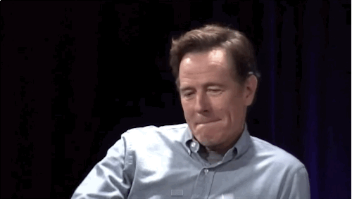 Hello! This post should be a bit briefer than my previous ones so far. I just want to reiterate the purpose of last week's primitive genre analysis and provide some more examples that I'll be inspecting in a matter of days. To recap, I've been incredibly passionate about politics and voting from a young age, and my involvement with an on-campus student advocacy organization has only intensified such feelings! Thus I've decided to analyze U.S. voter registration forms to see if there are any implicit factors that may be leading to such low turnout. Of course, the optimal solution to low voter turnout would be automatic voter registration at birth, but until such a process comes into effect, we could devise optimized paper forms and/or other mediums through which to attract new voters. So then what examples will I cite for this, exactly? Well, as a Nutmegger, I've already used Connecticut's official voter registration form as a sort of standard-bearer. But of course, I need a bit more than that to create something insightful. Given my obligations as a full-time university student (and yours as humans who don't wish to be bored to death), I simply can't peruse every state's forms! Therefore, I'll focus upon some of the states that are most critical to our electoral process: our swing states. I know that swing state has quite a flexible defintion and that a given state's connotation as one could turn on a dime, so I'll be taking a look at some of the most populous and wide-ranging among the following historically consistent pendulum-shifters:
Once I become a bit less preoccupied and decide upon a small assortment of these states, I'll compile their official voter registration forms and include their PDFs within my genre analysis for reference. Look out for my in-depth post this Friday! That's about all I have for you today, and until next time, I'll leave you with a Melodramatic Mike Drop™!  Hello again! As I become more ingrained within my Media Publishing class at UConn, I'll be tasked with developing a portfolio that documents my work toward a grander goal. After two weeks, it's finally time for me to kickstart this capstone project! But don't anticipate anything too big right now, for I'll be taking baby steps throughout the semester. Are you ready for me to reveal the first component of my project?  How I envision y'all behind your computer screens at this moment Well, before I dive into that, I figure it'd be appropriate to provide some personal context. Ever since I was old enough to understand the basic landscape (i.e. when I was in upper elementary school), I've been a politically-minded individual. I credit my stepdad for getting me so heavily invested in politics (heck, he even allowed me to sneak into the voting booth and bubble in his ballot during the 2012 presidential election - FYI I was only about 15 at the time!). I also remember initiating awareness of each significant party's presidential candidates for my sixth grade classmates (seriously, it's kind of a miracle that my peers never bullied me or avoided me like you would one of those rats carrying the Black Plague). But such nerdy enthusiasm for democratic advocacy persists within me. Remember how I cited my affiliation with UConnPIRG in my last blog post? Well, about a year ago I contributed heavily to the organization's New Voters Project, a campaign geared toward registering UConn students to vote on-campus prior to the 2018 midterm elections. With over 2,000 new students registered to vote and a 90% increase in turnout at the local Mansfield Community Center from that for the previous midterm elections in 2014, it's safe to say that we attained great success! 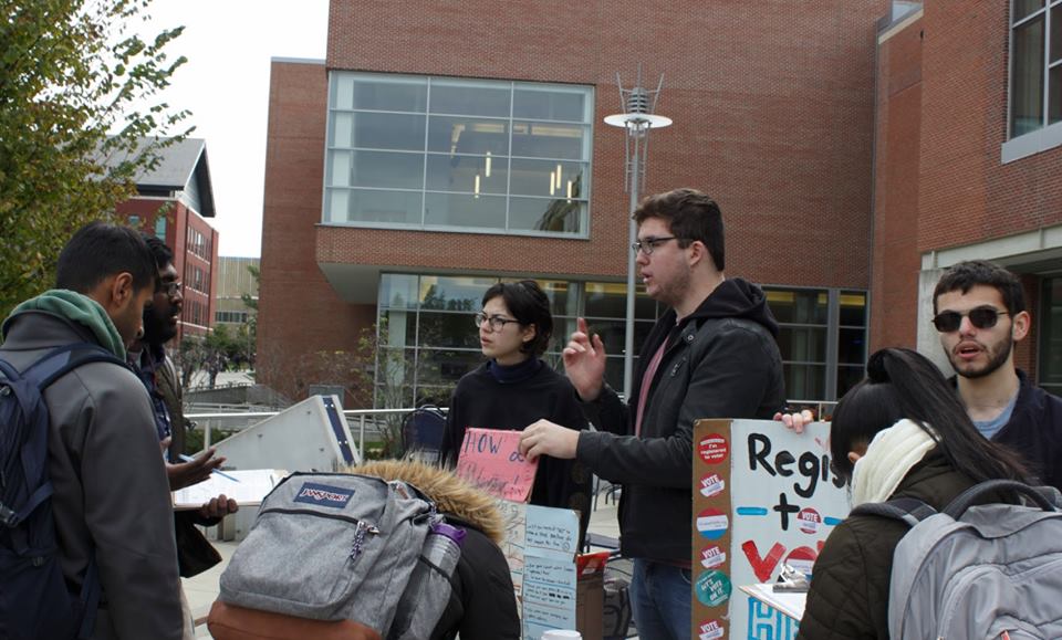 I can't quite put my finger on it, but something about that dorky-looking fella on the far right looks vaguely familiar... Anyway, one of our most critical tactics - as you can see in the lovely candid above - was (and still is) convincing students to complete Connecticut's official voter registration form. Take a look:
So, this document's pretty straightforward, right? In a concise, yet explicit manner, it gives you all the info you need to fill out the form properly. Each section is signified in ALL CAPS for easy access, with its main points arranged in bulleted or numbered lists and any especially pertinent details either underlined or emboldened. And the best part is that these instructions only take up about half the page, while the other half is devoted to individual documentation of each prospective voter. If I had to critique anything about the form, I'd say that it's quite achromatic, feels a bit cramped (particularly in the documentation section), and lacks variation in communication medium (i.e. the document's contents are predominantly text-based). But what relevance does any of this have to my long-term project, exactly? See, I just conducted an analysis of a work within the "U.S. voter registration form" genre. In a week's time, I aim to compare my home state's official document with that of some other states across the country. My hope is to compile the similar and contrasting elements of these voter registration forms, find areas of improvement, and (much further down the road) devise the ideal document (or, if necessary, another vessel entirely through which to register voters en masse) for use by all Americans, regardless of state residence. Our voter turnout numbers for municipal, state, and federal elections are simply way too low considering the domestic and global implications that come with performing our civic duty regularly, and perhaps my project will prove to be a step in the right direction as we head into a major election cycle in 2020 (or it'll merely become a footnote in Internet history; either outcome seems likely). That's about all I have for you today! Look out for my more detailed genre analysis next week, and until next time, I'll leave you with a Melodramatic Mike Drop™!  Ah, rhetoric! It's one of those words that we use incessantly and understand when we hear it, yet probably can't define too well. How frustrating, amirite? Rhetorical questions, statements, and devices often litter our everyday speech, but the art of rhetoric itself involves imparting effective, persuasive language. As you'll see throughout this blog post, there are plenty of ways - whether basic or more complex - to break down rhetoric. Lloyd Bitzer boils down the rhetorical situation to its most fundamental elements:
Take my most recent Daily Campus column, for example.
Diving deeper into the subject, we have the five canons of rhetoric:
Rather than unnecessarily blab to death about these fairly straightforward terms, allow me to provide you with this handy graphic: 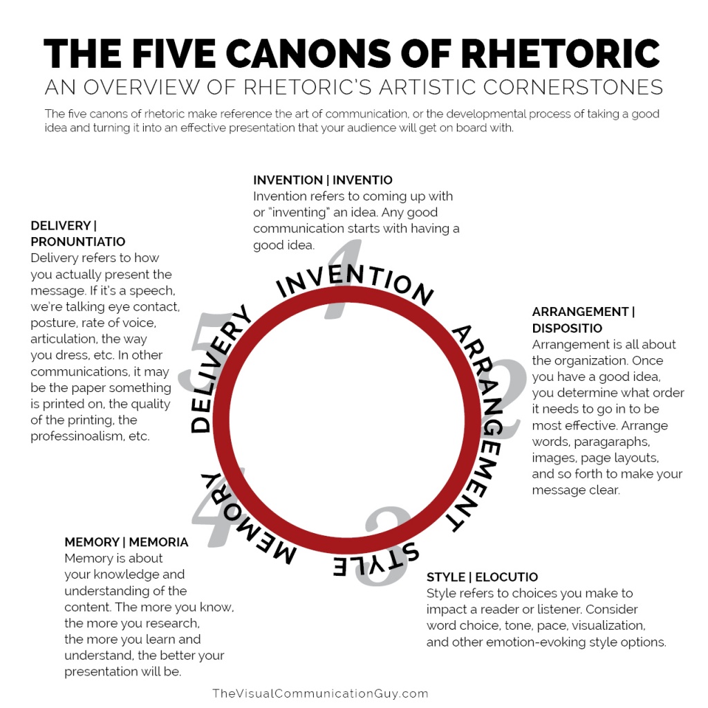 As UConnPIRG's chapter secretary, it may be appropriate to cite our organization's "class rap" (a prewritten speech intended to promote the organization and attract new members):
Douglas Eyman discusses the same five terms, but with a particular focus upon their application to digital media. He also astutely notes that these should be classified as adjustible, overlapping principles as opposed to rigid, separate rules. Let's reexplore the five canons of rhetoric within this context:
To wrap up this discussion, I ought to cite an active pioneer of the manipulation of digital media: our current president! Yes, as much as it nauseates me to admit it, President Trump truly has mastered many of the key elements outlined above. For example:
So, that's about all I have for you today! I hope that I managed to improve your understanding of rhetoric (as a writer, I consider these qualities regularly). Until next time, I'll leave you with a Melodramatic Mike Drop™!  |
AuthorWrite something about yourself. No need to be fancy, just an overview. Archives
November 2019
Categories |
||||||||||||||||||||||||||||||||||||
 RSS Feed
