|
Hello again! Well, I've been teasing y'all for about a week now, so I'd say it's about time that I finally deliver upon my promises! Today I'll be providing an in-depth analysis of U.S. voter registration forms, taking examples from different states and compiling my observations. But before I get into the fun part, I should probably provide you with some basic, yet obligatory explanations...  Hey, don't look at me like that! I'll make it quick, I promise! So, the name of my genre pretty much tells you everything you need to know. "U.S. voter registration forms" - they're forms that you use to register to vote, meant for any U.S. citizen who'll be of legal age (18) by the next electoral cycle. But I'm not just talking about presidential elections, or even congressional races for that matter! Technically speaking, every year is an election year, whether you consider the federal, statewide, or municipal level. Yet despite the importance of obligating our civic duty and the wealth of opportunities for us to do so, we're seeing criminally low voter turnout rates - particularly among young people, i.e. the people who're best equipped to effect positive change! Of course, voter registration forms are produced by each state's government. You can typically find them at a DMV facility, your local town registrar, or even some schools. And in the digital age, there are plenty of online and mobile avenues for voter registration, too (I may speak more to these not today, but sometime soon). For the purposes of this analysis, I'm sticking with the tried and true document, of which I've found several variations. Speaking of which...  Alright, alright! Take it easy now, guys and gals! My first example for this analysis actually comes from my genre announcement last week. Given that it's my home state, I figured that Connecticut would be a logical starting point. For those of you who didn't catch my original post upon its publication, allow me to reinsert the official form and my thoughts on it:
So, this document's pretty straightforward, right? In a concise, yet explicit manner, it gives you all the info you need to fill out the form properly. Each section is signified in ALL CAPS for easy access, with its main points arranged in bulleted or numbered lists and any especially pertinent details either underlined or emboldened. And the best part is that these instructions only take up about half the page, while the other half is devoted to individual documentation of each prospective voter. If I had to critique anything about the form, I'd say that it's quite achromatic, feels a bit cramped (particularly in the documentation section), and lacks variation in communication medium (i.e. the document's contents are predominantly text-based). Surely this is a solid stepping stone, but I need a bit more in order for my analysis to feel substantial. As important as it is for every state to have its voting registration practices inspected and improved upon, such a feat simply isn't tenable for an individual undertaking. So then where do I go from here? Well, I'll consider arguably the most urgent cases - populous swing states! Think about it - given the magnitude of their influence in our elections, it's imperative that as many of their citizens as possible can and want to make their voices heard! Let's begin with the most populous of these states: good ol' Florida sunshine!
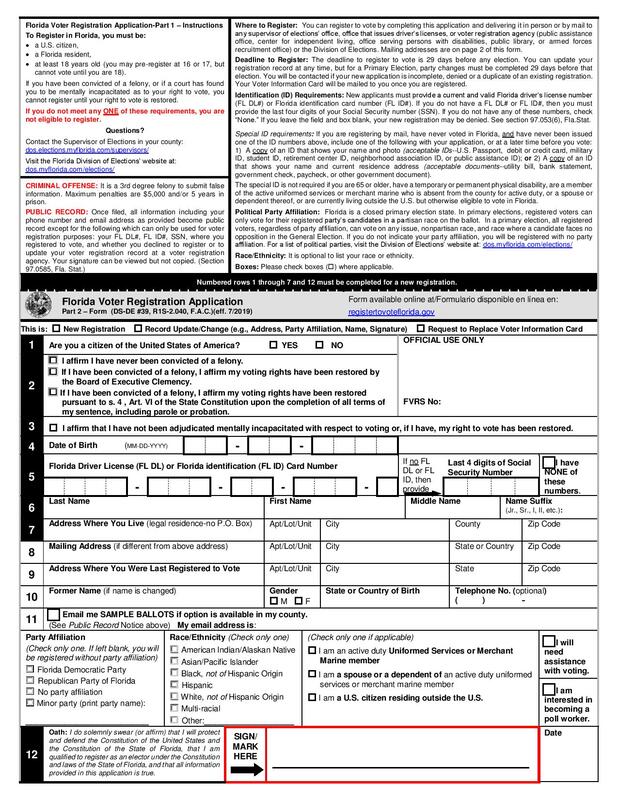 In this one, you see much of the info in paragraph form. I mean, yuck! However, at least each section has a bolded title, and the notes for discouraged actions have titles that are written in ALL RED CAPS (now, that's a safety warning if I've ever seen one!). Scrolling down to the documentation section, I'd say this one is much-improved from that of my home state. A gray box to signify the beginning of a new section, a link to complete the form online (way to get with the times!), and much more space to write within each box, oo la la! And even a new feature: a separate page full of destinations to which state residents can mail their forms! All in all, this one ain't too shabby. But let's see if the Penn is mightier than the shore:
Now, this one's definitely unique. Right off the bat, I see that it's four pages long, and I think, this is way too much, nobody would want to fill this out. But upon further inspection, perhaps that's a harsh way to look at it. First off, the Pennsylvania form lists its voting info in columns, with bolded titles and a mix of short paragraphs and bullet points. I won't lie, it looks pretty slick! Also, this is the first form I've perused that explicitly addresses non-English speakers, providing an avenue for obtaining a form written in Spanish! As does Florida, Pennsylvania provides a separate page listing addresses to which state residents can send their forms. And then its documentation section is so spaced out, it takes up over a page! In contrast to the other forms I've examined, Pennsylvania's devotes an entire row to each category before moving on to the next. It's nice that this one doesn't feel too cramped, and I'm sure it makes citizens feel that the voter registration process isn't too overwhelming. Other unconventional, yet much-appreciated elements include a mapping tool for the rural residents and homeless and a detachable envelope for sending the completed form to the appropriate County Voter Registration Office! I'll shut up about this one now, but man, am I intrigued by it! Ohio, you're up next:
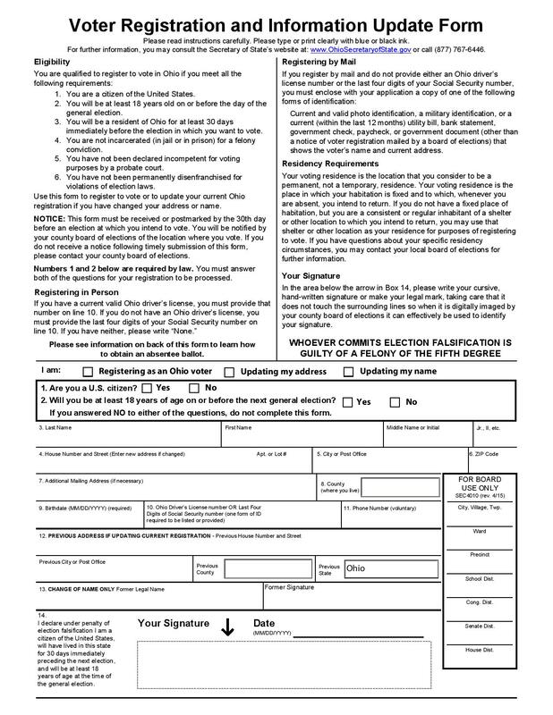 I find this one a bit underwhelming, especially after all the gushing I just did over Pennsylvania's form. For starters, much of the info in the first page's bolded sections is written in long-standing paragraphs, which I'm sure will immediately turn off a ton of people. Then, the documentation section harkens back to that of Connecticut's form; it gets the job done, but it just feels a bit cramped on half a page. But the thing that baffles me most is that there's even more pertinent info on a separate page after the documentation section, with section titles in BOLD AND ALL CAPS! I mean, why not just place it with the other info and keep the layout consistent? After all, both sections end with the same warning that "WHOEVER COMMITS ELECTION FALSIFICATION IS GUILTY OF A FELONY OF THE FIFTH DEGREE," so clearly they relate to each other anyway. Then you could devote an entire page to documentation. Overall, Ohio's form is serviceable, but many of its design choices just confound me! On to North Carolina:
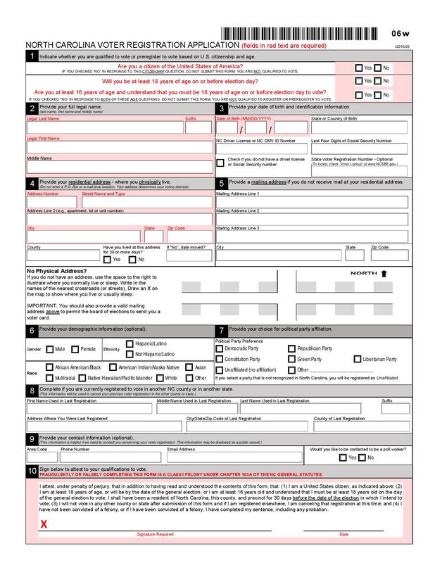 On the top right you can see a barcode, which definitely makes this form feel more official (or reminds me of grabbing my receipt as I depart from Price Chopper carrying bagfuls of groceries, but I guess either sentiment is apt). I appreciate that North Carolina puts its documentation section (i.e. the meat of the form) front and center, devoting a whole page to it and saving any additional info for the end. It even denotes required fields in red (finally, another form with some color variation!). The info page contains boxes with bold headers in differentiating gray slits and details in bulleted lists or short paragraphs, with certain words and phrases italicized or underlined. In general, North Carolina's form delivers arguably the best combination of conciseness and organization thus far. Ok, one more, and then I'll call it a day:
So, the first thing I notice about Michigan's form is that the headers of the info boxes are written in bold, all lowercase letters. I'm not sure whether to consider this new-age or outright informal for a government-issued document, but hey, at least it sets this one apart! I actually don't have much else to say here, except that I appreciate the entire page devoted to documentation, and that it contains a couple more graphics beyond the obligatory state seal (the clocks really drive home the urgency of completing the form immediately!). I know that I've been rambling for quite a while, but this exercise has been rather eye-opening for me. It's a fascinating case study into how the competing elements of these different state forms - which, remember, are designed to fulfill the same purpose - may affect one's ability and willingness to partake in democracy. My final thoughts:
Anyway, thanks for indulging me in this long-winded exercise! Feel free to comment below with any of your observations, and perhaps I'll consider them as well in the development of my capstone project! That's about all I have for you today, and until next time, I'll leave you with a Melodramatic Mike Drop™! 
0 Comments
Leave a Reply. |
AuthorWrite something about yourself. No need to be fancy, just an overview. Archives
November 2019
Categories |
||||||||||||
 RSS Feed
