|
Hello, everyone! I know that we've sorta established this pattern of reading analyses on Mondays and project updates on Fridays; but today I'll be deviating from this exact formula by combining the two into one, using everything I've learned about design thus far to analyze that of several different states' U.S. voter registration forms! I already highlighted a bunch of forms' design elements extensively throughout my genre analysis, so I'll reexamine those forms - alongside a few new ones - with the goal of creating some more general rulesets based around design and content. 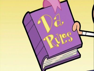 Time to open up that rulebook! So without further ado, let's examine Connecticut, Florida, Pennsylvania, Ohio, North Carolina, and Michigan's respective forms again, alongside those used in Texas, New York, Virginia, and Wisconsin: 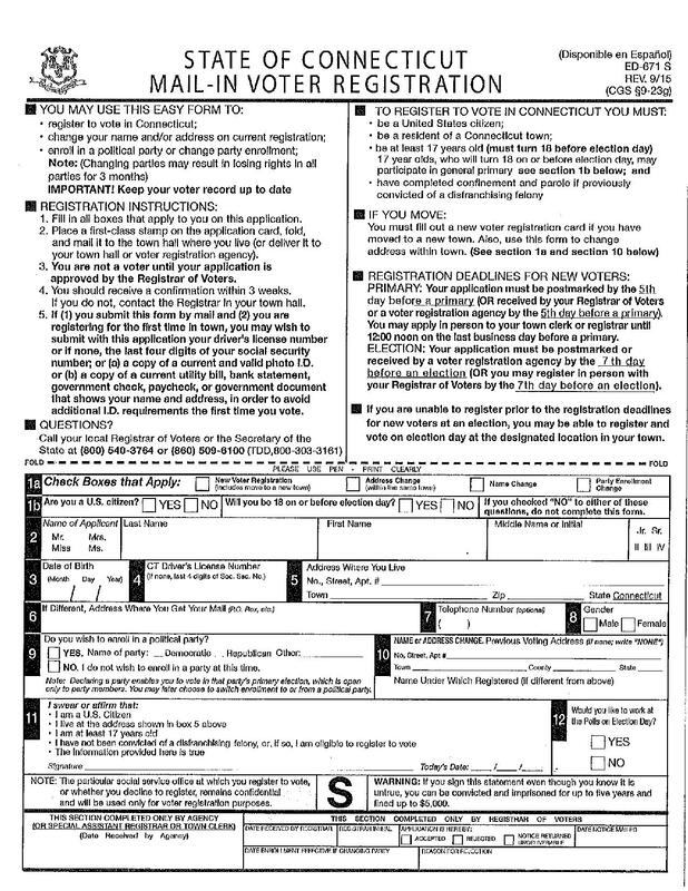 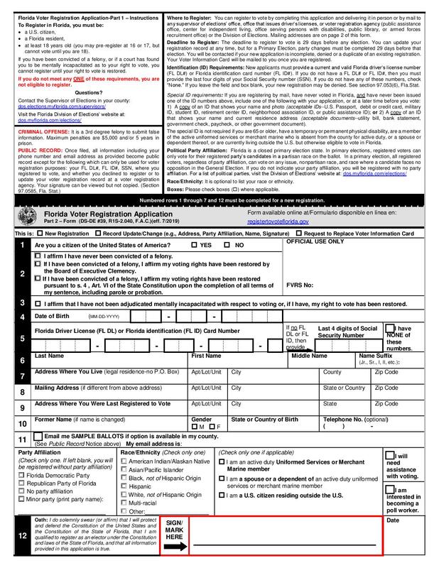 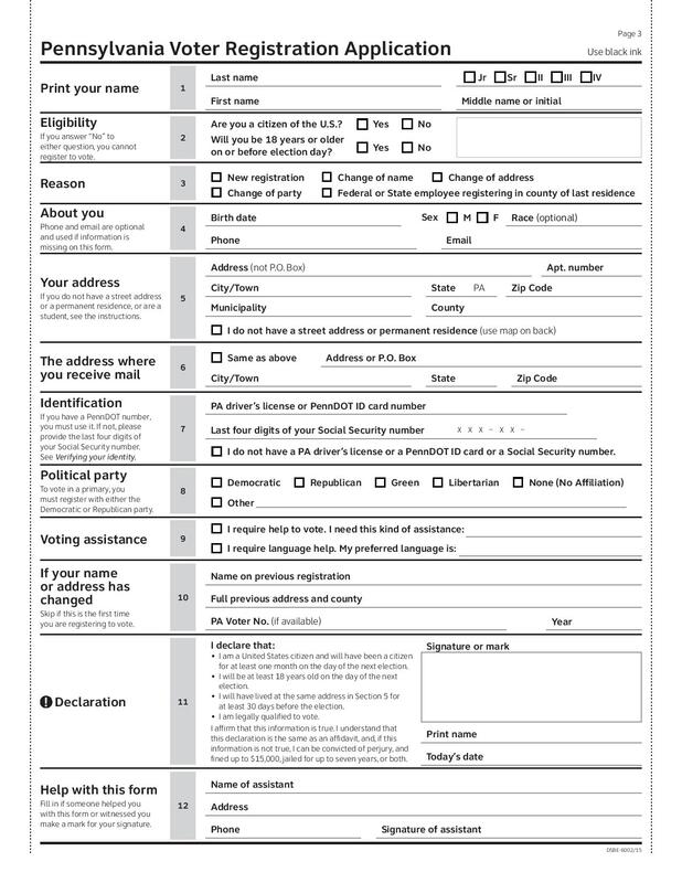 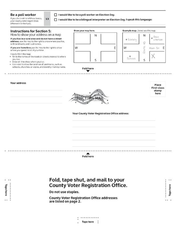 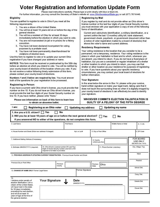 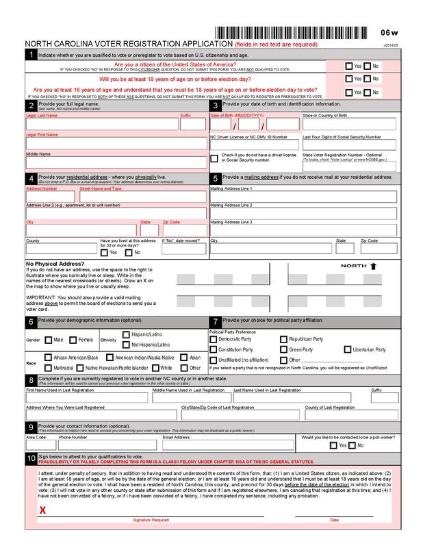 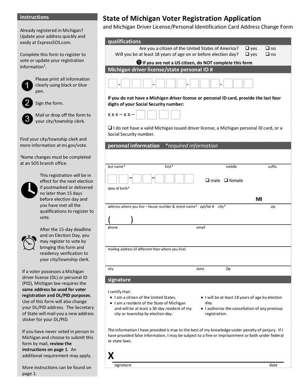 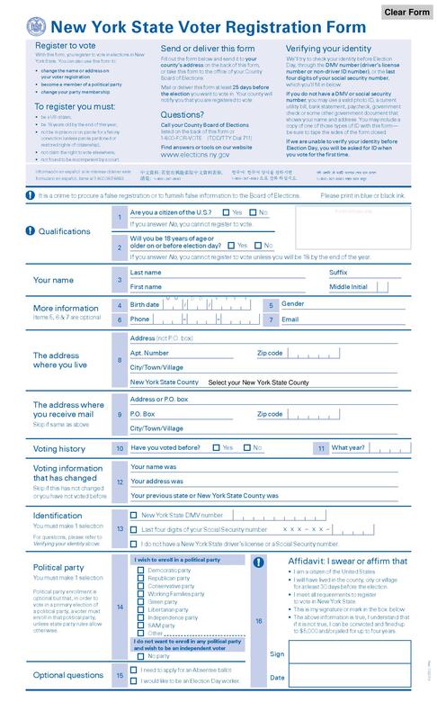 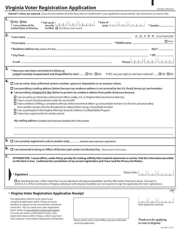 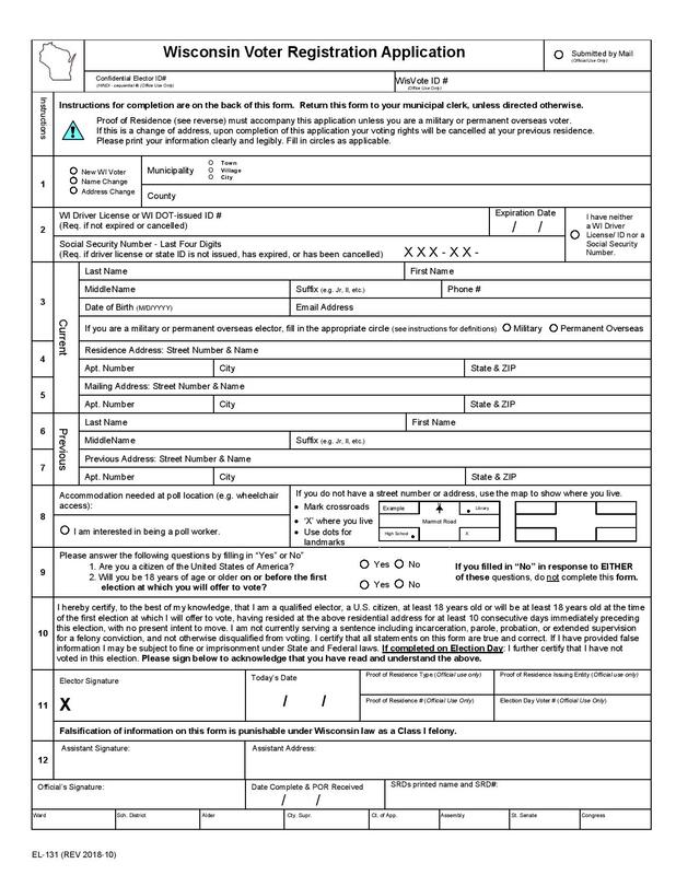 So, some consistent design elements include:
And contentwise, these forms commonly contain:
Hopefully this exercise proves insightful for us all as I create my project. And speaking of which, look out for my project prototype this Friday! That's about all I have for you today, and until next time, I'll leave you with a Melodramatic Mike Drop™! 
0 Comments
Hello, everyone! This week I continue my trek through online readings with a focus upon design! As someone who fancies himself as a sort of writing savant and doesn't really know the first thing about proper design, this should be an interesting venture, to say the least! First we have Robin Williams (no, not the late comedian)'s Non-Designer's Design Book: Design and Typographic Principles for the Visual Novice. Now, I wasn't sure how much I was supposed to read, so I only read the introductory chapter. Williams begins by recounting an epiphany that made her "realize the importance of being able to name things, since naming these principles is the key to having power over them." Basically she received a tree ID book as a Christmas gift one year, and it allowed her to identify the Joshua tree - an odd specimen that'd been heavily prevalent throughout her neighborhood. Then she lists the three steps to good design, which are to:
Lastly Williams identifies the four basic interconnected principles of design: contrast, repetition, alignment, and proximity. Well, I guess from now on whenever I design anything, I'll think to myself, Oh c.r.a.p., that looks wretched! or Oh c.r.a.p., that looks fantastic! And as a sidenote, this reminds me way too much of that "people order our patties" (i.e. "p.o.o.p.") mnemonic from the classic "Krusty Krab Training Video" - man, do I miss when Spongebob was actually good! But all kidding aside, again I only read the intro; yet as I skim through the rest of the book, it seems inviting to "non-designers" - hence the title - like yours truly. Ok, next up!  Plenty of designers do, Professor Farnsworth! So then there's Anne Frances Wysocki's "The Sticky Embrace of Beauty: On some formal relations in the visual aspects of texts." Here she cites a provocative New Yorker ad and analyzes several scholarly principles, including those of Williams - ah, I see what you did there, professor! - suggesting that the "approaches many of us now use for designing the visual aspects of texts are incomplete and, in fact, may work against helping us acquire critical and thoughtful agency with the visual." Wysocki's primary intent is "to support students (and myself) be [sic] generously and questioningly reciprocal in our designings." Although a bit long-winded, this one's a worthwhile, thought-provoking read that achieves its goals. To wrap things up, we have some excerpts from Arola et al. that've clearly been ripped directly from a textbook. "Analyzing Design Choices" outlines five basic design principles. As with Williams's categorization we have contrast, alignment, and proximity, but instead of repetition we have emphasis and organization. I don't have much to say about this one, except that I appreciate the concise, straightforward definitions and conceptual/visual examples of each term. That's about all I have for you today, and until next time, I'll leave you with a Melodramatic Mike Drop™!  Hello, everyone! I'm excited to provide another capstone project update for y'all today! This one shouldn't be too long, but I have some important things to share: First, I've been working on the documentation sheet for my U.S. voter registration form, which -as I mentioned in my tool demo - is designed around the American flag! It took a ton of time and effort - much more than you might think, in fact - to design and arrange everything properly, but here's my prototype (I would've provided a JPEG had the stars remained visible during the conversion). Note that I've labeled the stars alphabetically by state abbreviation and that I'll label the stripes later. It's a real beauty, isn't it?  Thanks, bud! Anyway, I've also compiled photos for my state-specific candidate info sheet! In my infinite wisdom, I didn't consider that 2019 is an off-year for state and federal congressional races; therefore I'll focus upon U.S. presidential and municipal candidates exclusively. I'll include only the major presidential contenders - seriously, I'm not gonna bother with that entire Democratic field - and my hometown (Avon, CT)'s town council candidates - because my goodness, it'd take so much work to cover everyone on pages 5 and 6 of this list! Here's my photo collection. For my last matter of business, let's discuss how well I'm adhering to my initial project timeline! Admittedly I've deviated a bit from my original plan, but truthfully the sequence in which I complete Steps 1-3 doesn't really matter as long as I satisfy them all by October 25. So here's what I still have to do leading up to that "Project prototype" deadline:
I hope that y'all are encouraged by this status update; I know that my hype for this project is absolutely THROUGH. THE. ROOF. That's about all I have for you today, and until next time, I'll leave you with a Melodramatic Mike Drop™!  Hello, everyone! As I did last week, I'll be diving into a bunch of readings - this time focusing upon American copyright policies! With a bit more time on my hands, I'll provide more in-depth impressions than I did during my last go-round. Alright, let's get to it!  Heh heh, "copy right" So first up is Lunsford et al.'s manifesto on ownership, authorship, and copyright. Overall it presents a pessimistic take on copyright, arguing that creators benefit greatly while the public hardly benefits at all. Key takeaways from this extensive, yet intriguing manifesto:
Next, legal activist and Creative Commons co-founder Lawrence Lessig cites the "Let's Go Crazy"-Stephanie Lenz Supreme Court case - which the aforementioned manifesto also details - to kickstart a more in-depth defense of fair use within the context of user-generated digital works. Check out his Wall Street Journal article, "In Defense of Piracy," below:
Lessig supplements this discussion with a TED talk about "laws that choke creativity." Here he cites John Philip Sousa's critique of talking machines, Thomas Lee and Tinie Causby's futile invocation of trespass law to obstruct aircraft flight, and the public domain-minded Broadcast Music, Inc. (BMI)'s victory over the licenseholding American Society of Composers, Authors, and Publishers (ASCAP). Before I move on, I'll just say that I thoroughly enjoyed the compilation of user-generated remixes that Lessig includes in his presentation! It relaxed me and almost made me forget that I was working on a homework assignment (emphasis on almost).  I was sorely tempted to procrastinate and search up some more of these silly remixes on YouTube, but I thought better of it; instead I binge-watched the newest season of Big Mouth on Netflix Then there's a pair of articles from Rockford University's Kyle D. Stedman and Winthrop University's Devon Fitzgerald Ralston. In "Sue for Mario Bros.: Nintendo vs. Emulation," Stedman discusses beloved video game giant Nintendo's recent lawsuits against ROM sites distributing its older and/or less easily attainable games, alongside the ensuing public outcry. As a diehard Nintendo fan, I knew full well of this case and some of the company's other anti-consumer business practices (still love its games, though!). In accordance with Stedman and the rest of the Nintendo community, I'd love to have ready access to older games as we did via services like the Wii's "Virtual Console" about a decade ago - put Game Boy, Nintendo 64, and Gamecube games on the Switch, dang it! - for the sake of historical preservation and pure enjoyment! In "'Cockygate': Trademark Trolling, Romance Novels, and Intellectual Property," Ralston discusses the "Cockygate" trademark conflict among romance enovelists. I must say, Faleena Hopkins's attempted trademark of "cocky" is almost as ridiculous as Ohio State University's attempted trademark of "the!" And yes, I've been using the trademark symbol alongside "Melodramatic Mike Drop" at the end of each blog post jokingly; but these incidents take things just a step too far, diminishing the value of the practice in the first place. Anyway, you can find both articles in the PDF below:
Now, I actually don't have much to say about these last few articles given their more straightforward nature. In "DMCA Notices: Here’s Everything You Need To Know In 2019," Claire Broadley provides a bunch of general info and resources regarding Digital Millennium Copyright Act (DMCA) notices, which protect against copyright infringement - heck, she even includes a DMCA takedown notice generator! This article's a bit shorter than you'd expect upon first glance - it boils down to a ton of pictures, bulleted lists, and short paragraphs - and a worthwhile read for those of us who may need to file a DMCA notice or respond to one. Meanwhile the U.S. Copyright Office's "More Information on Fair Use" concisely defines "fair use" and outlines the relevant criteria from Section 107 of the Copyright Act, namely the "purpose and character of the use, including whether the use is of a commercial nature or is for nonprofit educational purposes"; the "nature of the copyrighted work"; the "amount and substantiality of the portion used in relation to the copyrighted work as a whole"; and the "effect of the use upon the potential market for or value of the copyrighted work." Lastly, we have the Creative Commons Wiki's "Best practices for attribution." But please don't disregard this as "a typical wiki page," for it's surprisingly informative and easily digestible! Also note my consistent implementation of TASL (or TAS, at least): title, author, source, license. That's about all I have for you today, and until next time, I'll leave you with a Melodramatic Mike Drop™! 
Hello, everyone! Today I'll be providing another capstone project update! I've recorded a Kaltura screencast, where I showcase some tricks that I'll use to create one facet of my project. I opted to not record audio for this - I'm very self-conscious about hearing my voice recorded - so allow me to give some quick context behind what you're about to watch:
So as you know, I'm trying to create a more accessible and visually stimulating U.S. voter registration form that maintains the professionalism of a government-issued document and can be completed by any citizen regardless of state residence. In my project pitch, I mentioned that I'd compile U.S.-themed graphical elements for said form, and what's more American than our flag, right? However, my imagination's been running wild - as it tends to do because I pride myself upon my creativity - so I thought to myself, hey, instead of just plopping an American flag or two somewhere on the form, why not go the extra mile and build my entire form - specifically its documentation section - around it? Think about it - each of the fifty stars represents a state that each prospective voter can select to receive their appropriate state-specific candidate info pamphlet, and then the stripes can serve as the rows within which to document personal info! Also, Google Sheets and other data collection platforms aren't as well-known for their visual presentation capabilities, so this'll be a fun twist on their typical usage. Really, it's the best of both worlds as far as intrigue and viability are concerned! In the screencast embedded below, I demonstrate how to create the red-and-white stripes (i.e. add a fill color and merge cells), insert and arrange the stars, and insert text boxes into said stars (I'll label each one alphabetically with a state abbreviation). As a sidenote, I've also devised a compromise for the complicated issue of creating accessibility for non-English speakers. Although one of my peers noted astutely that online translators can be unreliable for long-range text, I feel that individual words and phrases shouldn't pose as great of an issue. Therefore, I'll create my instruction section and state-specific candidate info pamphlet in English only, but label each row of my documentation section in English, Spanish, and French (e.g. "Name/nombre/nom"). Anyway, check out my tool demo: That's about all I have for you today! Comment below whether you think I'm a creative genius and there's some method to my madness, or if you believe I've simply lost my marbles! Until next time, I'll leave you with a Melodramatic Mike Drop™! 
|
AuthorWrite something about yourself. No need to be fancy, just an overview. Archives
November 2019
Categories |
||||
 RSS Feed
