|
Hello, everyone! This week I continue my trek through online readings with a focus upon design! As someone who fancies himself as a sort of writing savant and doesn't really know the first thing about proper design, this should be an interesting venture, to say the least! First we have Robin Williams (no, not the late comedian)'s Non-Designer's Design Book: Design and Typographic Principles for the Visual Novice. Now, I wasn't sure how much I was supposed to read, so I only read the introductory chapter. Williams begins by recounting an epiphany that made her "realize the importance of being able to name things, since naming these principles is the key to having power over them." Basically she received a tree ID book as a Christmas gift one year, and it allowed her to identify the Joshua tree - an odd specimen that'd been heavily prevalent throughout her neighborhood. Then she lists the three steps to good design, which are to:
Lastly Williams identifies the four basic interconnected principles of design: contrast, repetition, alignment, and proximity. Well, I guess from now on whenever I design anything, I'll think to myself, Oh c.r.a.p., that looks wretched! or Oh c.r.a.p., that looks fantastic! And as a sidenote, this reminds me way too much of that "people order our patties" (i.e. "p.o.o.p.") mnemonic from the classic "Krusty Krab Training Video" - man, do I miss when Spongebob was actually good! But all kidding aside, again I only read the intro; yet as I skim through the rest of the book, it seems inviting to "non-designers" - hence the title - like yours truly. Ok, next up! 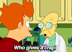 Plenty of designers do, Professor Farnsworth! So then there's Anne Frances Wysocki's "The Sticky Embrace of Beauty: On some formal relations in the visual aspects of texts." Here she cites a provocative New Yorker ad and analyzes several scholarly principles, including those of Williams - ah, I see what you did there, professor! - suggesting that the "approaches many of us now use for designing the visual aspects of texts are incomplete and, in fact, may work against helping us acquire critical and thoughtful agency with the visual." Wysocki's primary intent is "to support students (and myself) be [sic] generously and questioningly reciprocal in our designings." Although a bit long-winded, this one's a worthwhile, thought-provoking read that achieves its goals. To wrap things up, we have some excerpts from Arola et al. that've clearly been ripped directly from a textbook. "Analyzing Design Choices" outlines five basic design principles. As with Williams's categorization we have contrast, alignment, and proximity, but instead of repetition we have emphasis and organization. I don't have much to say about this one, except that I appreciate the concise, straightforward definitions and conceptual/visual examples of each term. That's about all I have for you today, and until next time, I'll leave you with a Melodramatic Mike Drop™! 
0 Comments
Leave a Reply. |
AuthorWrite something about yourself. No need to be fancy, just an overview. Archives
November 2019
Categories |
 RSS Feed
